COVID-19 Futures
If you are reading this, it is unlikely you are unaware of the COVID-19 pandemic. Either way, before quantifying the effects of this pandemic let’s consider what led us to the current state.
COVID-19 (short for Coronavirus Disease 2019) is a virus believed to have developed in Wuhan, China in 2019. It looks like this under a Transmission Electron Microscope:
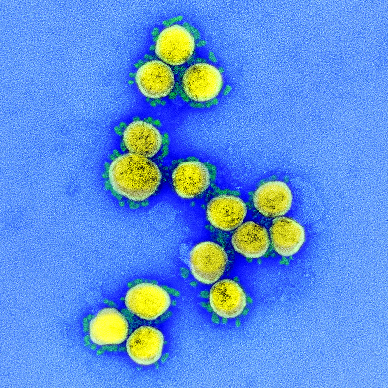
Viruses are the smallest infectious microbes composed of DNA/RNA surrounded by a protein shell. When a virus enters a living cell it modifies the cell’s actions. It can force the cell to produce more viruses which can burst out of the host cell, killing the host cell and going on to infect other cells (more information)).
COVID-19 (as well as SARS and the common cold) is a coronavirus. Coronaviruses are a class of viruses with spiky projections on their outer surface. These spikes are the protein receptors the virus uses to attach to and enter host cells. Determining the molecular structure of these proteins may lead to the development of a successful vaccine as described here. The efficacy and time required to create a COVID-19 vaccine is still unknown. Regardless, this pandemic will not be resolved once a vaccine is developed as the availability of the vaccine and the duration of immunity it could provide is still unknown (more information).
So far, the infection and death rate for COVID-19 is larger than the flu. However, this number has varied widely across the world indicating it depends on other factors.
It is easy to deny the reality of an issue when it is not immediately physical (e.g. on your doorstep). Towards this end, let’s look at the current data and project into the future.
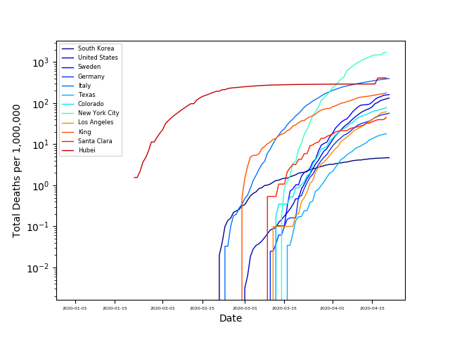
As the availability and use of COVID testing has widely varied across the globe, the number of cases is not well understood. Consequently, it is difficult to compare infection rates between regions in a meaningful way. Death rates from COVID appear to be reported more uniformly across the globe, so let’s consider COVID deaths. From the plots below we can see that COVID fatalities began in Hubei in January. This spread to Europe about a month later, and in the US another two weeks later. However, these numbers are still being updated.
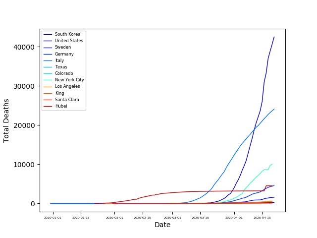
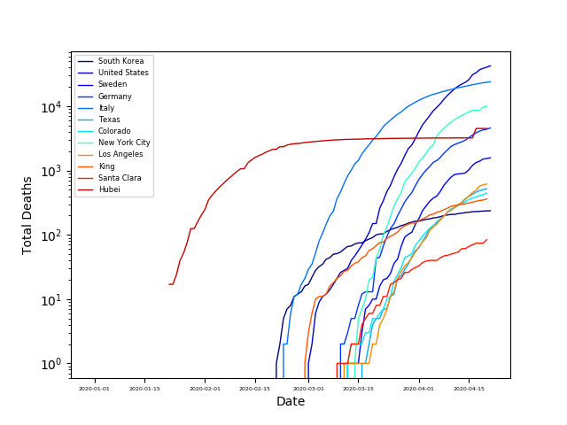
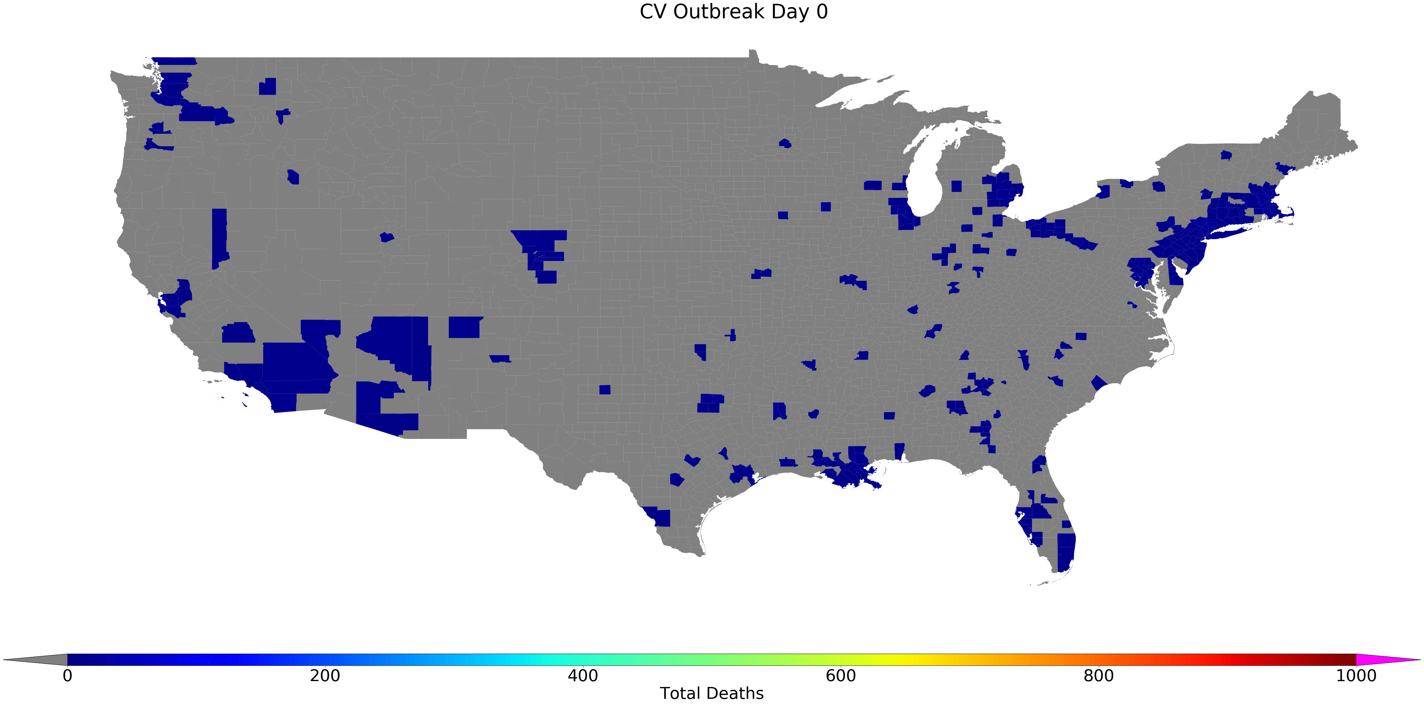
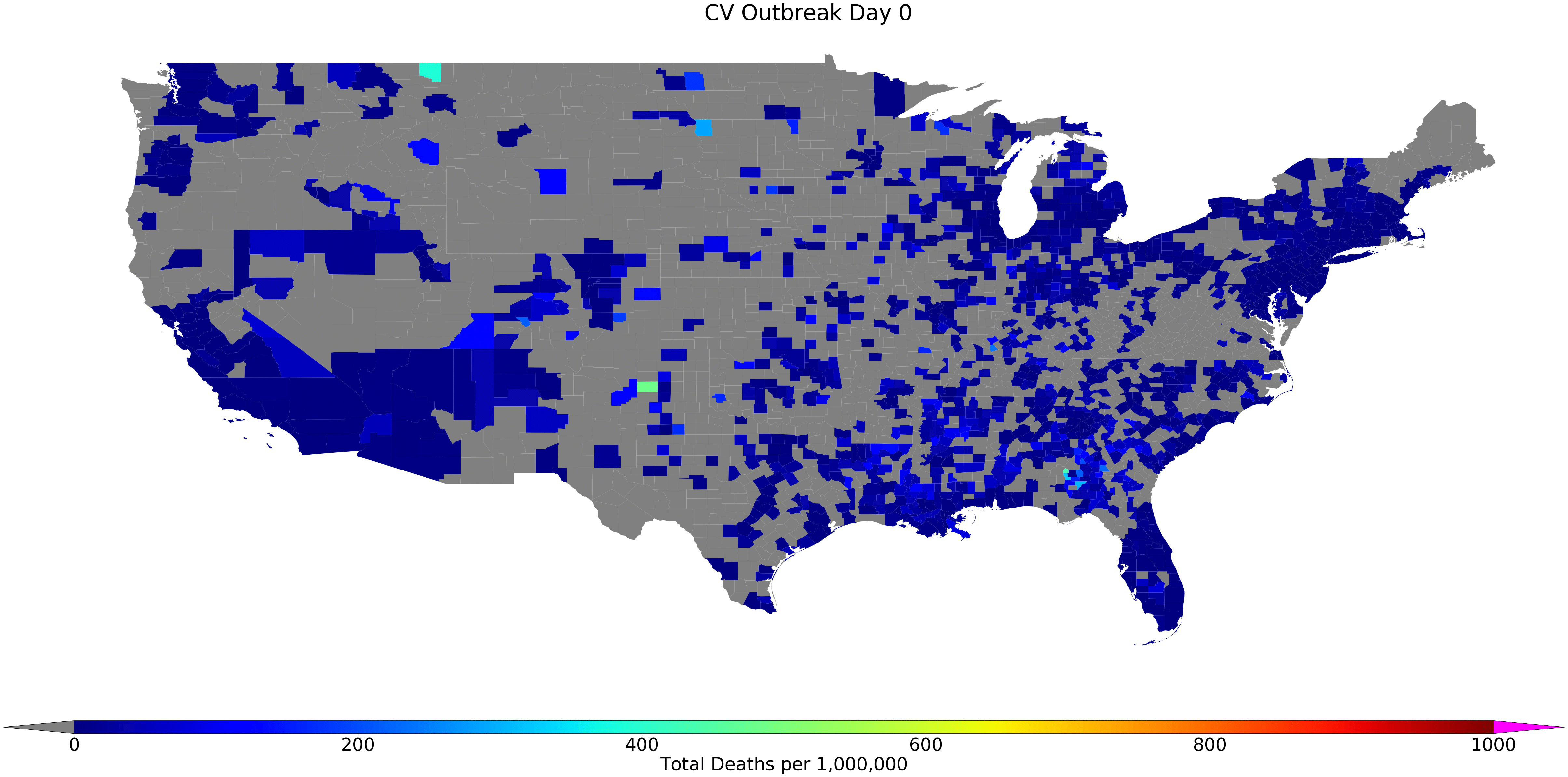
Let’s check how the outbreak developed spatially in the US by plotting the number of deaths vs. date here:

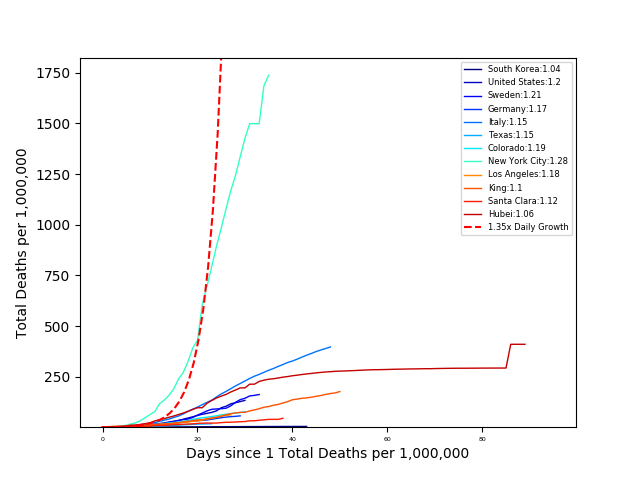
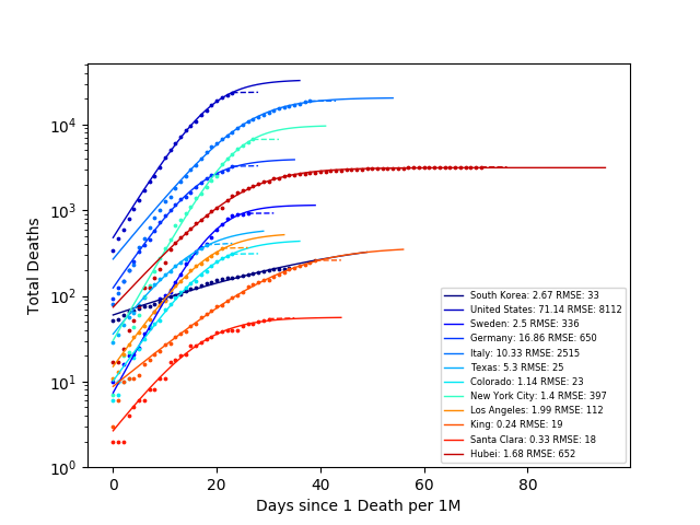
From this plot, it is hard to compare the death rates, since each country has a different population. So let’s look at the number of deaths per million people:
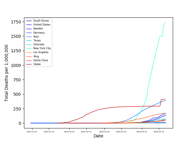

Note in all the GIFs gray areas have no cases/data for the given time period. Pink areas are ‘off the charts.’
From these plots, we can see the percentage of people that died from COVID is largest New York City and followed by Italy and Hubei. The steep slope of the other countries, is not encouraging. However, looking at South Korea we can see that they have significantly decreased their death rate through their mitigation strategies.
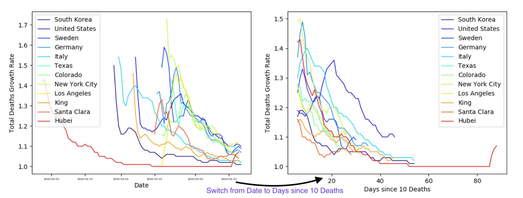
However, it is still a bit difficult to compare the outbreaks in each country, since it reached each area at different times. So, let’s compare the number of deaths to the number of days since 10 Deaths for each area.
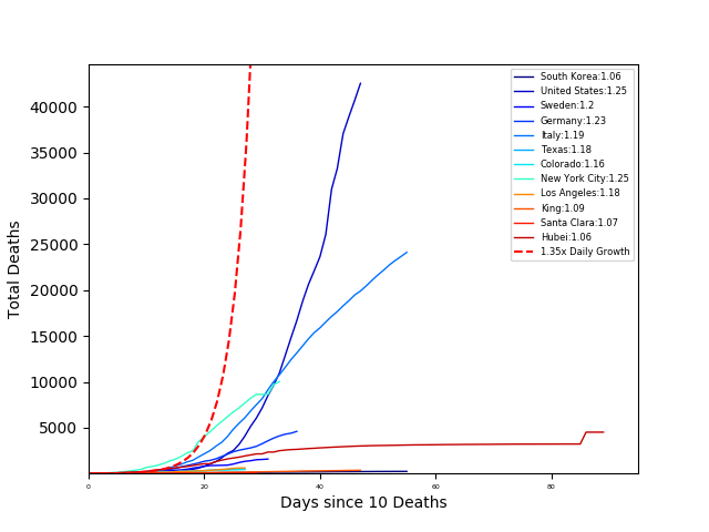
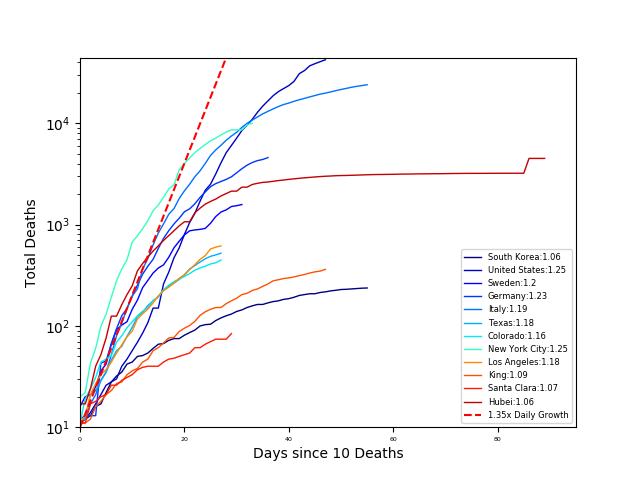
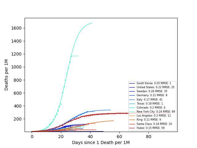
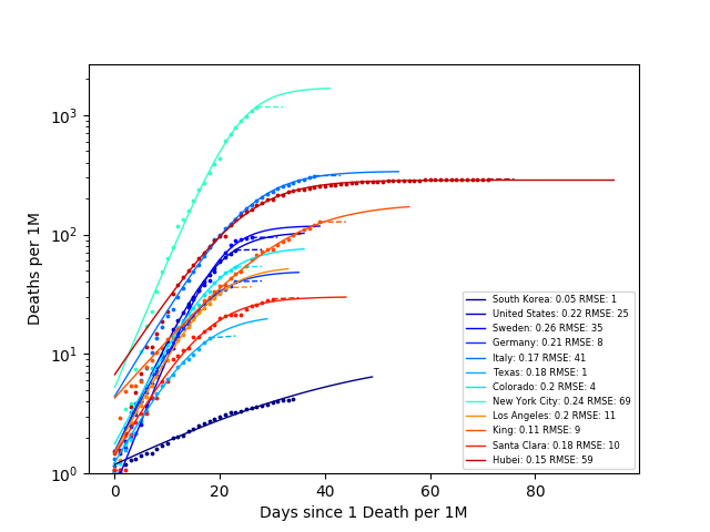
The number next to each area in the legend is the COVID growth rate (calculated as the slope of the log-linear fit). From this plot South Korea is ‘winning’ (killing the least people). However, it is still hard to compare countries when we do not normalize the number of deaths by the population. So again, let’s look at the number of deaths per one million people vs outbreak days. In this case, outbreak days are defined as the number of days since one death per million people.
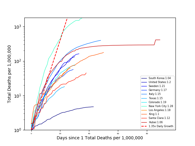
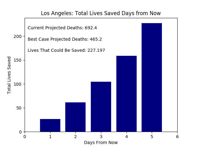
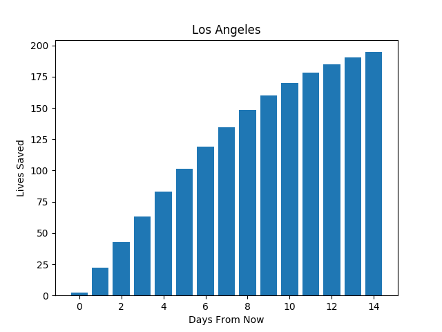
From the GIF we can see that the death rate is increasing most rapidly per outbreak day in New York, Louisana, and Southwest Georgia. Also, we see that South Korea has contained the outbreak the most effectively with a growth rate of 1.05, while the US has the largest growth rate (comparing only countries), at 1.2. Idealistically, if the US ‘flattened the curve,’ matching South Korea’s growth rate many lives would be saved. In Los Angeles County about ~1,500 lives would be saved.
But it is still easy to think one person’s actions do not contribute much (e.g. it’s fine if I don’t self isolate). So let’s break these numbers down more. Let’s assume each person contributes equally to their countries growth rate (which is not true, but we must start somewhere). Then calculating the difference between a South Korean’s individual contribution to the growth rate and an American’s, we have the change to the American growth rate due to one individual. Plotting the changes in the number of deaths in Los Angeles if one person acts like a South Korean we have:
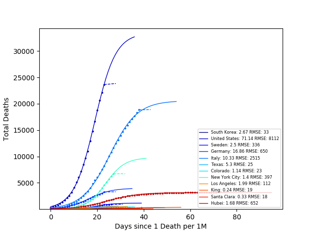
However, these approximations assume that the number of deaths grows exponentially indefinitely. This is obviously not the case - we cannot kill more people than there are. There are various models for pandemics (e.g. SIR), but let’s start simply by fitting to a sigmoid curve, which is a decent first approximation that does not scale exponentially for all times. Fitting the number of deaths to a sigmoid curve we have:
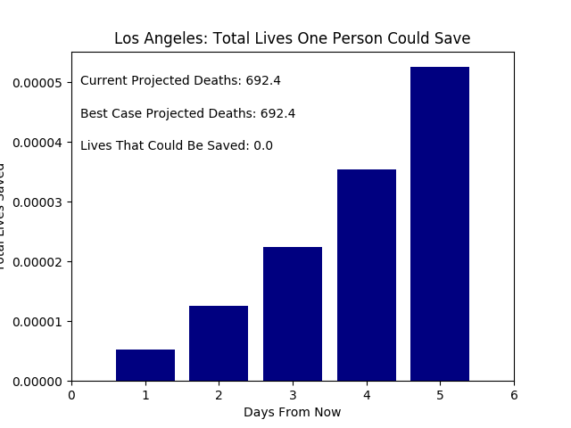
We can calculate again the number of lives saved if Los Angeles was able to decrease their growth rate to South Korea’s.
The sigmoid fits are closer to reality, but have significant uncertainties and are very sensitive to inital conditions. So, the hunt for the model that describes reality most accurately continues.
Many time-series have been modelled decently using recurrent neural networks (RNNs). In particular, long-short term memory cells (LSTM). RNNs are often used in machine translation and time series modelling. The internal states of RNNs store not only the input information but also the context of that input (e.g. information about other inputs/the past). This means as the algorithm processes training samples it uses information from the previous training samples as well to model the current sample. The algorithm is considered recursive in this sense. In the case of predicting the number of COVID deaths on a given day, knowing the number of deaths the previous days is extremely helpful.
There are numerous resources that describe the history and architecture of LSTMs, so I keep my remix brief. LSTMs are composed of three processing layers: forget gate, input gate, and the output gate. The forget gate takes a given input (number of deaths on a certain day) and the hidden state (information from the previous days) and decides what information to keep. This information is then passed to the ‘memory’ of the cell and the input gate. The input gate takes this information and decides which values to update in the memory of the cell and adds it. Finally, the output gate takes the information passed to the forget gate and decides what to keep in the hidden state for modeling the next input.
LSTM layers come in many flavors and meta-structures. After some testing, I decided to use a ‘vanilla’ two layer stacked LSTM with dropout. I trained the LSTM with data (new cases and deaths, total cases and deaths) up to a given day and had it predict the next five days.
Here are RMSE vs. Epoch validation plots for the number of layers, LSTM hidden layer dimensions, and dropout values.
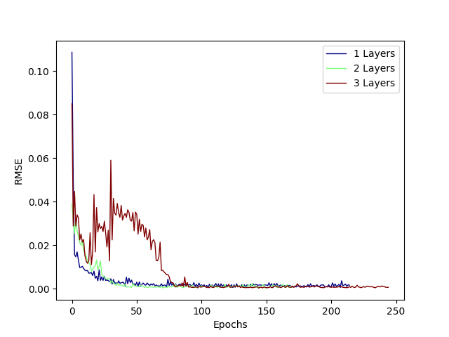
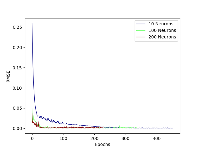
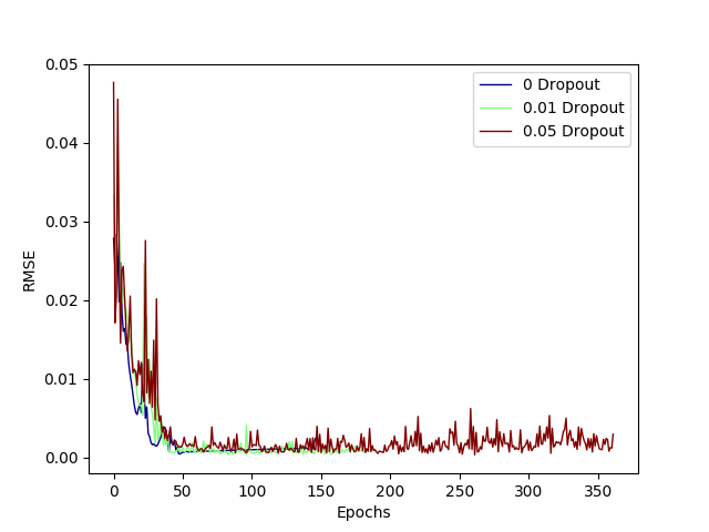
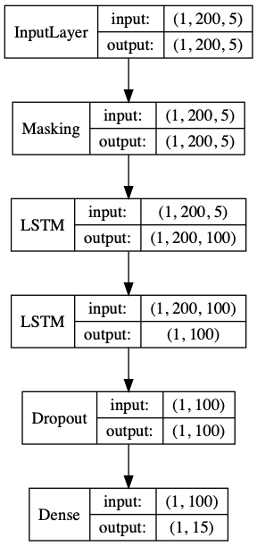
Based on these hyperparameter studies, I chose to use two layers with 100 neurons each and a final dropout layer of 0.01, as shown in this diagram. Note: masking was applied as the input sequences had varying lengths and this is effectively a seq2seq network.
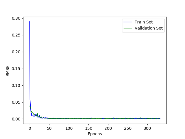
The RMSE for this architecture reaches a decent minima around 100 epochs as shown below.
Finally, we can see the predicted number of deaths for five days in the future for every day in the training and test sets. The errors bars on the prediction were calculated using the same network but with a drop out of 0.2.
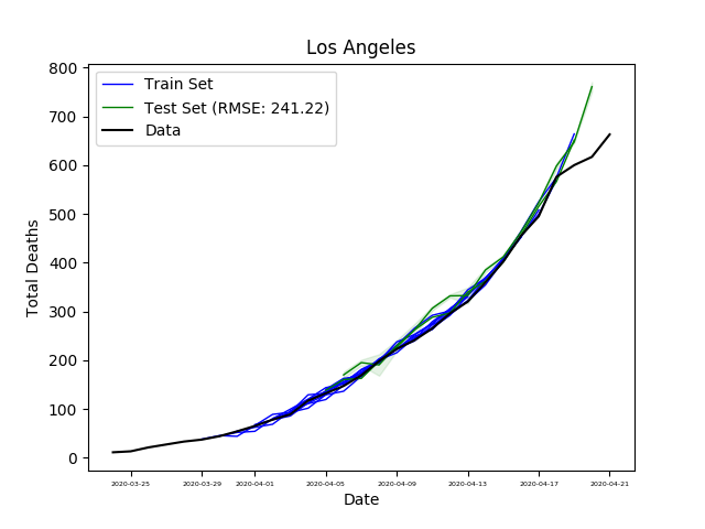
The LSTM prediction is decent, but obviously still does not match reality. Looking at the data more closely, this week the death rates in Los Angeles have decreased as shown below, due to SIP orders (for the other areas as well).
The death rate is calculated as the slope of the log-linear fit to the number of deaths from the past five days. This number is quite abstract. So, let’s consider the COVID doubling time: the number of days until the number of total deaths doubles. Longer doubling times mean less deaths.

Note that China was off the scale here, but in case you are curious here is the uncropped plot for doubling time.
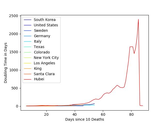
From these plots, it is safe to conclude that social distancing measures have dramatically increased the doubling times, decreasing the number of deaths. Moreover, individual actions do matter and can weaken this pandemic. As Dr. Deborah Birx said we currently have ‘no magic bullet, it’s just our behaviors that dictate the course of this viral pandemic over the next thirty days.’
However, continued shutdowns will likely have far reaching physicologial, physical, and economic tolls. Given all this, what is the best path forward? Best is relative to one’s values, so I will leave it to you to decide.